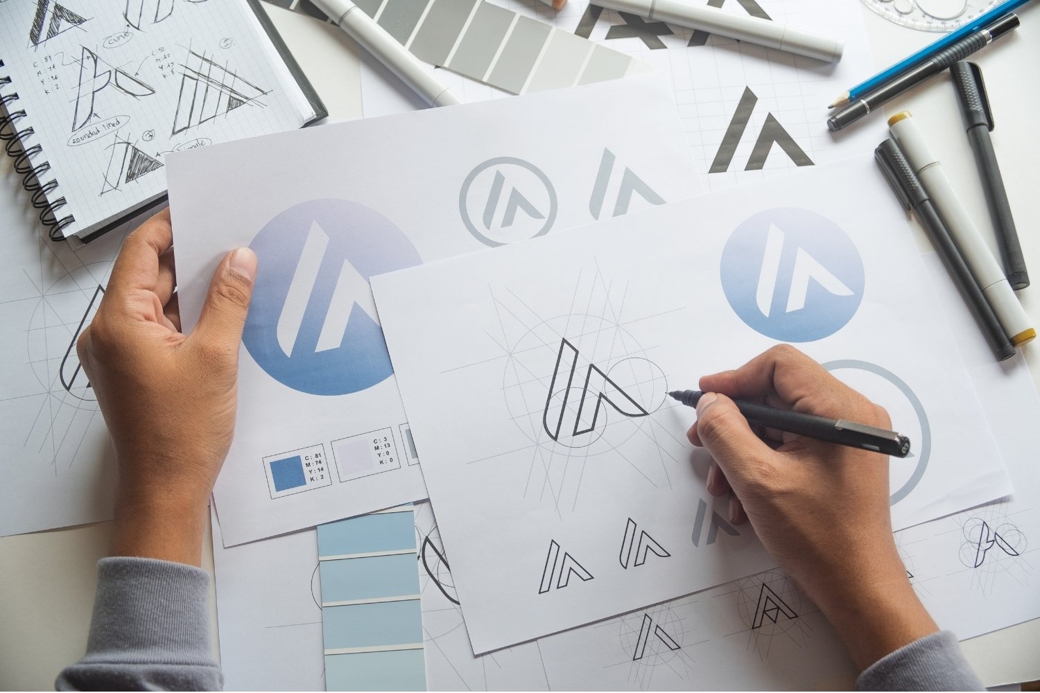
So you’re starting a business. You’ve got the idea, maybe even the name, and now everyone keeps asking the same question: “What does your logo look like?”
If your honest answer is “I have no idea where to start,” you’re not alone. Most new business owners have never had to think about logos before. You know a good one when you see it, but what actually goes into one? What makes it look professional instead of homemade? And should you make it yourself or pay a graphic designer?
That’s exactly what we’ll cover here. First, we’ll break down what a logo is made of, in plain English. Then we’ll walk through 25 logo ideas that graphic designers use every day, with real examples of the kinds of businesses each one suits. Finally, we’ll help you pick a direction and figure out the best way to get your logo made, whatever your budget.
Grab a notebook. By the end, you’ll know what you want.
What actually goes into a logo?
Let’s start with the basics. When a graphic designer builds a logo, they’re really putting together five ingredients:
- Your name. Sometimes the full business name, sometimes just the initials.
- A symbol (optional). A small picture or shape that stands for your business, like a coffee bean or a simple circle.
- A typeface. The style of lettering. This sets the mood more than most people expect. Rounded letters feel friendly; sharp, thin letters feel elegant.
- Color. Usually one to three colors that match the feeling you want customers to have.
- Versions. A full logo for your website and signage, a small version for social media, and plain black and white versions for printing.
That’s it. Every logo you’ve ever seen is some mix of those five.
The four things every good logo does
Once you know the ingredients, here’s how to tell if a logo is actually good. Keep these four tests handy, because we’ll use them later.
It works small. Most people will first see your logo as a tiny circle on Instagram, WhatsApp or Google Maps. If it turns to mush at that size, it’s not working.
It works in one color. Your logo will end up printed on receipts, stamped on packaging and embroidered on uniforms. If it only makes sense in full color, it’ll let you down.
It’s simple. Think of the logos you recognize instantly. Almost all of them are surprisingly plain. One clear idea beats five ideas squeezed together.
It feels right to your customers. A logo for a children’s party business should feel very different from one for an accounting firm. The question isn’t “Do I like it?” It’s “Will my customers trust it?”
The five types of logo (in plain English)
When you talk to a graphic designer, they’ll probably use a few of these words. Here’s what they mean, so you can say exactly what you want.
| Type | What it is | Great for businesses that… | Just watch out for |
|---|---|---|---|
| Wordmark | Your business name in a special style of lettering | Have a short, catchy name | Long names that get hard to read when small |
| Monogram | Your initials, joined into one shape | Have a long name, or want a neat social media icon | Letter combos that look like a brand that already exists |
| Symbol | A picture or icon with no words | Want something people recognize without reading | Overused icons, like lightbulbs and globes |
| Combination | A symbol and your name, used together or apart | Want flexibility (this is what most small businesses choose) | Two busy parts fighting for attention |
| Emblem | Your name inside a badge or seal | Sell food, drink, crafts or anything with a traditional feel | Tiny text that disappears on a phone |
No need to choose yet. As you read the ideas below, just notice which ones make you think “that feels like my business.”
Ideas 1–6: Make your name the star

If you want people to remember your business name, the simplest move is to make the name itself the logo. It’s also one of the most affordable routes, because there’s less to design.
1. A classic typeface with one special touch
This is what graphic designers recommend most often, and for good reason. Your name is set in a well-made typeface, then one or two letters get a small custom touch: a joined pair of letters, a softened corner, a little flourish.
It looks polished and professional, but it’s still unique to you. It works for almost any business, from a consultancy to a skincare line. If you do this yourself, check that the font is licensed for business use first.
2. Friendly lowercase letters
Write your whole name in lowercase and it instantly feels relaxed and approachable. That’s perfect if you want customers to feel like they’re dealing with a real person, not a big company.
Think cafés, online shops, children’s brands or a local cleaning service. Just pick a typeface with some personality, so you don’t blend in with everyone else doing the same thing.
3. The elegant serif
Picture the name on the front of a glossy magazine, with thick and thin strokes and a touch of class. This style tells customers you’re premium, and it lets you charge like it.
It’s a natural fit for boutiques, salons, bridal businesses, jewelry and interior design. One tip: make sure the thin strokes are thick enough to show up on a phone screen.
4. Bold, chunky letters
Big, heavy letters feel strong and confident. They’re easy to read from across the street, which matters a lot if your logo goes on a van, a shop sign or a food truck.
This suits builders, fitness studios, street food and anything with energy. Keep the spacing generous so the letters don’t crowd each other.
5. Hand-lettered or script
A name that looks written by hand feels personal and warm, like the business is made with care.
Bakeries, florists, wedding businesses and handmade products love this style. Just make sure people can actually read it. If customers can’t read your name, they can’t search for you or tell their friends.
6. Your name plus a short line
Put your name in large type with a small line underneath, like “Home Cleaning” or “Tailoring & Alterations.” It tells new customers what you do in a single glance.
This is really helpful if your name doesn’t explain your business, or if you rely on local, walk-in customers. Just drop the small line from your social media icon, where it’d be too tiny to read.
Ideas 7–12: Play with your initials
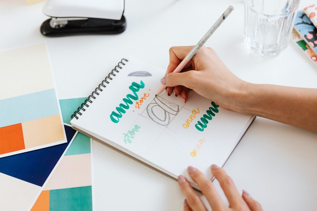
Got a long business name? Initials can be a lifesaver. They fit neatly into a social media icon, a website tab or the corner of a business card, which is why so many graphic designers reach for them.
7. Initials in a simple frame
One or two initials sitting inside a circle, square or arch. It’s clean, it’s timeless, and people instantly read it as a logo.
This works for nearly anyone: consultants, law practices, beauty brands, photographers. The key is making the letters themselves a little special, so it doesn’t look like a template.
8. Joined letters
Two initials that share a line, so one letter flows right into the next. When it’s done well, it feels clever and custom.
It’s lovely for fashion brands, jewelers and anyone who wants a polished, upscale look. Just make sure both letters are still easy to recognize.
9. The stacked stamp
Letters stacked in a neat square, a bit like an ink stamp. Square shapes fill a profile picture perfectly, which you’ll appreciate every time you post.
It suits businesses that stamp or label things: coffee roasters, bakeries, soap makers, clothing labels. Keep the letters big, or it starts to look like a QR code.
10. The signature
Your initials, or your first name, written like a signature and cleaned up by a designer. It feels like you personally stand behind every product.
This is a great choice for personal brands: coaches, stylists, makeup artists, photographers and chefs. Ask your designer to thicken the strokes so they hold up at small sizes.
11. The hidden letter
One letter drawn solid, with a second letter tucked into the empty space around it. People spot the first letter, then a moment later, they notice the second. That little “oh!” makes it stick.
It suits creative businesses that want a touch of cleverness. Test it small, though, because hidden details love to disappear on phones.
12. The initial that becomes a shape
A designer simplifies your initial until it turns into a shape: an S into a wave, a D into a half-moon, an M into mountain peaks. You get a symbol with meaning built in.
This works well if you want a symbol but don’t have an obvious object to use. The test is simple: it should look good even if nobody ever spots the letter.
Ideas 13–18: Find a symbol in your business
A good symbol lets people recognize you before they’ve even read your name. The best ones usually come straight from what you sell, where you are or why you started. Here’s where graphic designers look first.
13. Your product, simplified
Take the thing you sell and draw it as simply as possible: a cup for a café, a leaf for a skincare brand, a slice for a pizza place. Customers get what you do in half a second.
The trick is making it yours. A plain coffee cup is everywhere, so ask your designer to add a twist, like steam that forms your initial.
14. A tool of your trade
Use something you work with every day: scissors for a tailor, a whisk for a baker, a paint roller for a decorator. It shows expertise and honesty in one go.
This suits trades and service businesses. Keep it simple, with just one tool, not a whole toolbox.
15. A nod to where you are
A local landmark, the shape of your city’s skyline, a river or a hill everyone knows. It tells customers you’re part of the community.
This is brilliant for local businesses: restaurants, shops, tour guides, real estate agents. Just be careful if you plan to grow into other cities, because a very local symbol can feel limiting later.
16. A mascot or character
A friendly animal, a cartoon chef, a little smiling sun. Characters are memorable, and customers (especially kids) grow attached to them.
They work well for food brands, children’s products, pet businesses and anything playful. Ask for a simple version too, since detailed characters get lost at small sizes.
17. Something from nature
A leaf, a wave, a sun, a mountain or a flower. Nature symbols feel calm, fresh and trustworthy.
They’re popular with wellness, beauty, organic food and outdoor businesses, so they can be common. Stand out by combining the symbol with your initial, or picking a less obvious plant or animal.
18. A symbol with a hidden meaning
An arrow tucked between two letters. A heart shaped from two hands. A symbol that means more once you notice it. These give people something to talk about.
Any business can use one. The key is keeping the hidden idea simple. If it takes a paragraph to explain, it’s too complicated.
Ideas 19–25: Styles that build a whole brand
These last ideas go beyond a single logo. They give you a look you can carry onto packaging, your website, your uniforms and your social media, so everything feels like it belongs together.
19. The badge
Your name, plus your city or the year you started, set inside a round or shield-shaped badge. Badges feel established and trustworthy, even if you opened last month.
They’re perfect for coffee, beer, barbers, bakeries and craft products. Ask for a simpler version for small uses, since text around a circle gets tiny fast.
20. One simple shape
A circle. A half-moon. A square tilted slightly. It sounds almost too easy, but simple shapes are the ones people remember, and they look sharp everywhere.
This suits modern brands, tech startups and minimalist products. Pair it with a name in a distinctive typeface so the shape is linked to you.
21. A signature color
Keep the logo simple, then choose one strong color and use it everywhere: packaging, shop front, uniforms, website. People often remember a color before a shape.
This works for any business that wants to stand out on a busy shelf or street. Pick a color that suits your customers, and avoid this year’s trendy shade so it doesn’t date.
22. A pattern you can reuse
A simple repeating pattern, like stripes, dots or tiles, that appears inside your logo and also works as a background on bags, wrapping paper and social posts.
It’s great for shops, fashion brands, gift businesses and anything with packaging. Keep the pattern bold, because fine details turn into a blur when small.
23. The vintage look
Classic lettering, simple line drawings and muted colors that feel like they’ve been around for decades. Vintage styles suggest quality and tradition.
They fit barbers, bakeries, restaurants, tailors and handmade goods. Just make sure it still feels fresh, not dusty. A good designer knows the balance.
24. A logo that changes color
One fixed shape that changes color for different products, services or seasons. A skincare brand might use a different color for each scent, for example.
This is ideal if you sell a range of products. Keep the shape exactly the same every time, or people stop recognizing it.
25. A logo with a story
We saved a special one for last. Hide a personal detail in your logo: a symbol from your culture, your grandmother’s handwriting, the first tool you ever used. Now you’ve got a story to tell every customer who asks, and stories are how people remember you.
Only one rule: the logo must look good on its own first. The story is a bonus, not the main event.
How to pick the right idea for your business
By now you’ve probably got a few favorites. Good! Here’s a simple way to narrow them down to one. It takes an afternoon, and you don’t need any design skills.
- Picture your ideal customer. Who are they, how old are they, what do they care about? Write it down in one sentence. Your logo needs to feel right to them, not just to you.
- Choose three words for how you want customers to feel. For example: “warm, fresh, local” or “calm, premium, trustworthy.” These three words will guide every choice.
- Look at five competitors. Screenshot their logos and put them side by side. Notice the colors and styles they all use. Now you know what to avoid, so you don’t blend in.
- Pick three ideas from this list. Choose ones that match your three words and don’t look like your competitors.
- Gather a few examples. Save logos you like on Pinterest (not from competitors). Note what you like about each one: the color, the lettering, the shape.
- Decide who will make it. You can try it yourself with a free tool, or hand your notes to a graphic designer. More on that in a moment.
- Test before you commit. Whatever you end up with, run it through the checklist below.
Your logo checklist
- You can read it at the size of a social media icon
- It works in plain black and in plain white
- It looks different from your five competitors
- It matches your three words
- You have a full version and a small icon version
- You own the files and the rights to use them
Mistakes new business owners often make
We see these again and again. The good news is they’re all easy to avoid once you know about them.
Putting everything in. Your product, your name, your slogan, three colors and a picture of your city. It’s tempting to say it all, but a busy logo is a forgettable one. Pick one idea.
Copying a big brand. It might feel like a shortcut, but it can land you in legal trouble and makes you look like a knock-off. Take inspiration from the idea, never the drawing.
Choosing what’s trendy. This year’s popular style will look dated in two years. Aim for something you’ll still be happy with when your business is five years old.
Only thinking big. You’ll probably imagine your logo on a big shop sign. But most customers will see it as a tiny icon on their phone. Check that it works small first.
Getting the wrong files. A JPG or a screenshot won’t work for printing signs, shirts or packaging. You need proper files, which we’ll cover below.
Using a free font you’re not allowed to use. Some free fonts can’t be used for business. Check the license before your logo goes on anything you sell.
Should you make it yourself or hire a graphic designer?
Honestly? It depends on your budget and how much your logo matters to your business. Here’s how the options compare.
| Option | Typical cost | Good if… | The trade-off |
|---|---|---|---|
| Free logo maker | $0–$30 | You’re testing an idea and money is tight | Other businesses may end up with a very similar logo |
| Ready-made template | $20–$60 | You need something quickly and simply | Not unique, and you may not own the full rights |
| Freelance graphic designer | About $60–$180 for a basic custom logo | You want something original that you fully own | Takes one to two weeks, and you need to give clear direction |
| Design agency | $1,000 and up | You’re funded and need a full brand system | Expensive for most new businesses |
If you’re just testing a business idea, a free tool is completely fine to start with. You can always upgrade later.
But if you’re ready to launch properly, a freelance graphic designer is usually the sweet spot. You get a logo made just for you, proper files, and someone who has solved this problem many times before, all for less than most people spend on their business cards and signage.
That’s where Fiverr comes in. It’s where we usually point new business owners, because you can browse designers’ past work, compare prices and read reviews from real customers before you pay anything. Fiverr also holds your payment until the order is complete, and you can ask for revisions along the way, so you’re not handing over money and hoping for the best.
Browse logo designers on Fiverr →
Tip: use the notes you made in the “How to pick” section as your brief. Designers love a client who knows what they want, and you’ll get a much better result. Want a step-by-step walkthrough? Read our guide, How to Hire a Logo Designer Without Wasting Money.
The files to ask for
Whoever makes your logo, make sure you get these before you call it done:
- Vector file (AI, EPS or SVG), so your logo can be printed at any size
- PNG with a transparent background, for your website and social media
- PDF for printers
- Black and white versions
- Your color codes and font names
- Confirmation that you own the design
Questions new business owners often ask
Do I really need a logo to start my business?
You can start without one, but you’ll need one sooner than you think. The moment you set up an Instagram page, print a business card or put a sign on your door, a logo helps people remember and trust you. A simple one is enough to begin.
How much should I spend on my first logo?
For most new small businesses, somewhere around $60–$180 gets you a good custom logo from a freelance graphic designer. If money is very tight, start with a free logo maker and upgrade once you’re earning.
What colors should I use?
Start with how you want customers to feel. Greens and earthy tones feel natural and calm. Blues feel trustworthy. Warm reds and oranges feel energetic and friendly. Soft pastels feel gentle and playful. Pick one main color and keep it consistent everywhere.
Should my logo show what I sell?
Not always. It helps if your name doesn’t explain what you do. But many successful logos are just a name or a simple shape. What matters more is that it’s clear, memorable and fits your customers.
How long does it take to get a logo made?
With a freelance graphic designer, plan on about one to two weeks, including a round or two of changes. A free logo maker takes an afternoon.
Can I change my logo later?
Yes, and plenty of businesses do as they grow. Just try not to change it too often in your first couple of years, because customers need time to recognize it.
Your next step
You don’t need a perfect logo on day one. You need one that’s clear, simple and feels right to the people you want to serve.
So take the three ideas you liked most, write down your three words, and decide how you’ll get it made. If you’d like a professional to handle it, you can find a logo designer on Fiverr and have your logo ready in a couple of weeks.
Either way, you’re one step closer to launch. That’s worth celebrating.
Some links on this page are affiliate links. If you buy through them, Deosher Studio may earn a commission at no extra cost to you.